color

What Does Your Brand Color Palette Say About Your Business?

What-Does-Your-Brand-Color-Palette-Say-About-Your-Business.jpg

Color choice is an extremely important marketing decision for virtually any brand. The colors chosen for branded logos have a direct psychological impact on potential customers, so taking the time to select the optimal color scheme for branded imagery can have a direct impact on a company’s bottom line. Every color has a meaning and a personality behind it. Leveraging these facets in branded imagery can have a massive effect when it comes to customer engagement, attracting new business, and standing out in a specific market.

Meanings Behind Different Colors

Most companies choose branded color schemes of only one or two colors. More than two colors can look busy, but that doesn’t mean it cannot work. Consider the logos of major companies like Google, eBay, NBC, and Microsoft for great examples of how multicolor branded palettes can work. However, most companies find the best results with one or two colors for their logos and other branded marketing materials.

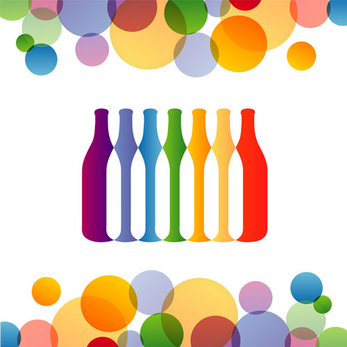
Consider the meanings behind different colors:

  • Red evokes feelings of urgency, danger, passion, and energy.

  • Yellow is a calmer color that also translates to high-energy and positivity.

  • Orange blends the effects of red and yellow, extolling fun and youthfulness.

  • Green can convey wealth and prestige, but also natural beauty and serenity.

  • Blue tends to convey reliability, wisdom, and responsibility.

  • Purple often correlates with luxury and high quality, but also nostalgia and spirituality.

  • Brown conveys durability, natural simplicity, and earthiness.

  • Black can send a message of high quality, luxury, professionalism, and sophistication.

  • White conveys feelings of cleanliness, purity, and softness.

Once there is a firm understanding of the meanings behind different colors, it should be decided what aspects of the company culture, brand values, and core concepts will be conveyed to the market base through the branded imagery. In the end, the colors that are selected should resonate the most with the company’s culture and values.

RELATED ARTICLE: How to Use Color Psychology in Your Favor

Determine the Colors That Resonate With Company Values

Once the implications of different color options are understood, brand owners should start asking a few important questions to determine the ideal color scheme:

  • Does the brand tend to convey a more masculine or feminine image? 

  • Does the brand appeal to a younger or older consumer base?

  • What timeframe does the brand resonate with the most? Is it a classic or modern brand?

  • Is the brand message loud and energetic or more subdued and sophisticated?

  • Does the brand image convey luxury and high class or affordability?

  • What is the tone of the branded messaging? Is it something playful or something more serious?

These questions can help businesses determine the ideal color schemes for their brands. Of course, the best color palette will not have the desired results without reliable and effective printing services.

If you’re interested in applying your branded color palette to your product packaging with the most reliable, sustainable, and highest-quality printing services available, reach out to Century Label today to learn more about our color management and custom label printing services for your business.

How to Use Color Psychology in Your Favor

By now, you’ve likely put a great deal of thought into your packaging. You’ve probably even envisioned a color scheme that satisfies your aesthetic preferences. However, have you considered the psychology behind color choices?

Color Psychology Is Everywhere

Next time you’re out and about, take a look around at the multitude of products and business brandings that are on display on every billboard, business sign, poster and street corner. Since you’ve been considering your business’s packaging and how it relates to your branding, you’ve likely realized that each and every aspect of a brand is chosen very carefully. The color choices businesses make for their brand’s advertising and packaging schemes are no different.

How-to-Use-Color-Psychology-in-Your-Favor.jpg

If you group businesses of similar types together, you’ll notice several consistencies. Restaurant signage tends to be in reds, oranges or yellows, and for good reason – these colors are thought to represent hunger, warmth, and energy. Red is also an attention-getter, explaining its presence on a great number of business brands as well as important street signs.

Read on for a quick guide for the most common characteristics of all the colors of the rainbow:

  • White indicates purity, technology, neutrality, and calm. Apple and car manufacturers use this color.

  • Black represents strength, power and elegance. Find it in Nike and CBS signage.

  • Brown inspires dependability and productivity. Used by UPS and JP Morgan.

  • Pink represents femininity, youth, and gentleness. You can find it in a multitude of feminine products and brands.

  • Red inspires hunger, energy, determination, and passion. Look for red in brands like Target, CNN and multiple food service companies.

  • Orange indicates enthusiasm and success. Find orange in brands like Amazon and Harley-Davidson.

  • Yellow is for happiness and energy. You’ll see yellow as an attention getter in taxi companies as well as brands like Best Buy and McDonald’s.

  • Green represents wealth, nature, and safety. Green is often found in financial logos as well as packaging for “green” products or household cleaners – think Scrubbing Bubbles.

  • Blue inspires strength, dependability, and peace. You’ll find blue in Walmart, Lowes, and AmEx’s branding.

  • Purple represents extravagance and power. You can find purple in both Cadbury and Hallmark’s branding.

Color Psychology Is an Inexact Science

There’s no guarantee a specific color will make a consumer feel a certain way about your product. In truth, it’s likely each of these colors have the reputation they do because we have, over the years, assigned specific characteristics to certain situations and brands. Still, color psychology is worth considering when you’re choosing the color scheme of your packaging. After all, if even 25% of your target market sees your black packaging and derives the strength, power, and elegance you’re aiming for, you’re well on your way to a packaging color scheme that serves you.

If you’d like to incorporate color psychology into your private packaging label, contact Century Label for more information regarding your options.

Let’s Get Started

The design team at Century Label is ready to help you take your vision and apply it to your products. We will take you through every step of the process, preserving the integrity of your brand and using high-quality printing techniques.

Our customer care specialists are standing by to make sure every order is exactly the way you imagined it, ensuring your satisfaction. Request a quote today to get started on your own quest for branding success.

Custom Bottle Labels That Stand Out from a Crowd

The craft brew market is growing, which is great news for the industry. Individual brewers are seeing more competition for the same consumers, so it’s up to each brewer to find a way to stand out from the masses. You know your beer is the best, but until consumers buy it, they don’t. How do you get the customer to choose your brew? Custom bottle labels. 

Craft beer labeling matters almost as much as the beer’s taste. Customers have to notice your brand so they can find out just how fantastic it tastes. Maybe your labels just don’t pop. Maybe they’re looking for your beer, but they can’t remember what the labels look like. Either way, crafting a solid impression is just as important as crafting the beer itself.

Take a look at some of these custom bottle labels from Century Label. You’ll never forget them, right? What gives something like the Great North Aleworks or Sun King Brewing labels such an edge?

Designing-Custom-Bottle-Labels-That-Stand-Out-from-a-Crowd

Color Me Surprised

Turns out, there’s a lot of science behind why customers prefer one brand design over another. Color, texture, typeface, and material all influence buyers’ choices. Did you know that 90 percent of judgments about a product are made because of color alone? 

Color selection and design need to be based on the personality of your brand. Is your craft brew a down-to-earth, average Joe’s choice? Go with an earthy brown, basic bottle. There’s an entire psychology behind color theory and its impact on marketing. There’s a lot of debate about how much, say, yellow affects someone’s mood. 

One thing that’s certain…

Colors provide associations your customers may not be aware of. 

Sometimes, it’s best to let your product do the talking. If you’re bottling your drinks in clear glass, for example, you need to design your label in a way that highlights the drink itself. This includes matching the colors of your drink to the label.

Century Label’s custom bottle labels for Sun King are good examples of this strategy. The combination of vibrant, warm colors works really well for a standout, high-energy brand. Take a look at the colors. That orange and blue combination is a classic of color theory. The strategy here is using complementary colors – colors on the opposite sides of the color wheel from each other – to make the product bright and sharp. You can also use a monochromatic design, with one color in different shades, and triple color schemes for different effects. That’s the advantage of custom bottle labels – they really arecustom.

Crafting Memories

The size of the market means you can’t afford to have a generic label design. Your beer needs a custom bottle label that people will remember. You need to consider all aspects of your container, product, and even the sales environment. Buyers will have trouble recognizing your product’s name if the text on your bottle is too small or unclear. And while a reflective, metallic texture will certainly catch the eye, it also may be difficult to read if you don’t make accommodations for lighting. 

The drink’s container also has an impact on your labeling. A bottled drink offers less design space than a canned package. Century Label’s Wolf Pack design is an innovative solution: Some bottles are made from aluminum, which, in addition to other advantages, turns the entire bottle into a canvas. This solution means the beer has a consistency in its design – even across containers and materials.

There is no universal rule for good bottle label design. Branding your beer comes naturally, and you know yourself and the product better than anybody. Choose the custom bottle label that works best for your drink’s identity. 

For a no-obligation, confidential initial custom bottle label consultation with one of our design experts, click here.

Up to Bat: Your Role in Making Every Run a Home Run


Up to Bat: Your Role in Making Every Run a Home Run?

Part 3 of a 3-part series on color management.

In our most recent post, we talked about how Century Label’s equipment, software and printing expertise combine to give us precise quality control over your label and shrink sleeve jobs.

A great outcome for your next print job is directly related to specifying precisely what you want at the start of the ordering process. What do we mean exactly? Here are some of the things you can do to make sure we understand your printing expectations:

  • If you’re looking to have existing printed material duplicated, it’s a good idea to provide a sample when you make the order. This is especially helpful if you worked with another printer previously.

  • When providing digital art files, they should be in one of these formats: .ai (Adobe Illustrator), .eps (Encapsulated Post Script), .tiff (Tagged Image File Format), .psd (Photoshop Document), or print-ready .pdf (Portable Document Format).

  • If your digital material contains images that have been placed in a large file, such as an Adobe InDesign document, the links to those placed images must be either included, or embedded in the file, such as in a .pdf file. (View instructions and how-to videos here.)

  • Any fonts included in the document must be outlined. (View instructions and how-to videos here.)

  • If you need white plating, or under-prints, to provide backing for a specific color, we have instructions and how-to videos that can view here.

  • If your digital file is raster (instead of vector), the resolution should be 300 pixels per inch (ppi at 100% scaling) to get a clean, crisp reproduction in print.

All of these tips and more are covered in our Art File Check Sheet (also downloadable here) that guides you through the steps needed to help you tell us exactly what you want. Completing this check list makes sure all the information we need to fulfill your order is at hand, and helps put you in control of the printing process.

It’s all about Century Label helping you show your true colors.

Read Part 1 & Part 2.

Behind Every Great Label is Great Technology

xxxxxx

Part 2 of a 3-part series on color management.

As we mentioned in an earlier post, Century Label has made a significant effort to continuously advance our color management protocols and update production equipment to make sure the colors of your print job reproduce exactly the way you want and need them.

That commitment has led to updating everything from the lighting in the rooms where we examine color, to the press we use to print proofs for you to examine, to the color sample books we keep at our desks.

The quality of the viewing light has a big impact on color appearance. In designated areas, including all press rooms, the ink mixing station, and in certain offices, D50 color correction lighting has been installed, where pre-press technicians, equipment operators and customers alike can more accurately evaluate the continuity of color. D50 lighting is accepted as THE Graphics Standard when it comes to lighting - helping us do away with any “invisible” influence on the way color is perceived by the naked eye under varying viewing conditions.

We’ve also added SpotOn! Color - press-side software that enables more precise spot color control on our flexographic presses. HD Flexo is the more advanced printing process that utilizes improved, digital flexographic plates to print at a higher quality and resolution than standard flexo plates. This advanced software, for example, enables press operators to get optimum color reproduction from run to run.

What’s on the horizon? We are currently working on creating special profiling for our HD Flexo printing process that will allow us to use one of our digital presses for enhanced color proofing. This proofing method will help customers avoid the high cost of spec runs, and at the same time, provide a proof on a given job’s deliverable substrate.

Again, all this so that Century Label can help you show your true colors.

Read Part 1 & Part 3.

Show Your (Brand’s) True Colors

Show Your (Brand?s) True Colors

Part 1 of a 3-part series on color management.

Brand consistency is critical; you know that.

Your brand identifies your business to your customers and clients, to competitors, to the public at large. Your brand stands for everything you do to make your business stand out.

Color management has a lot to do with brand consistency. Even if your company doesn’t have “official colors” for your brand -- and chances are you do, with specified hues expressed in numbers matched to a particular shade in a color sample book -- people can often tell one brand from another by color alone, even before they see a distinctive logo. Think Home Depot. Think UPS.

So it’s important to get those colors right, especially across all forms of print collateral -- business cards, brochures, billboards, product labels -- by which most people encounter your brand.

It’s not enough to see the colors on your desktop computer and say, “That looks right. That’s what I want.” Different computer monitors display the same color different ways, and they’re all different from what appears on paper, just because of the difference between colors made of lit-up pixels and colors made of mixed inks.

Even your own eyes might fool you, because your brain interprets the information provided by your eyes and compares it with your experience of what things “should” look like.

Those of us who remember taking photos with film cameras and getting photos back from the drugstore might remember how photos that were taken under fluorescent light looked green, when we clearly don’t remember the actual scene looking that way. (Forgetting to select the proper “white balance” on your digital camera can give you the same results.)

A printing professional, whether she uses a computer screen or a grand digital or HD flexo press, controls color not just by looking at the image and matching by eye, but by analyzing the components of the color, reducing them to numbers and using those numbers to command a press to duplicate that color exactly.

Also, the printing professional will have charts and other tools that help her keep track of what colors are possible to depict in different media, from the point its on screen to in print.

The printing professional will have specialized graphics computers with monitors that have been calibrated to display colors faithfully and matched to an objective standard.

The laptop or tablet on which you view your company’s web site, your financial spreadsheets, and your company e-mail likely doesn’t have that.

The printing professional may be working with specialized software that communicates with press equipment and enables her to more accurately reproduce defined color.

The printing professional may even be working in a room lit by special lights designed to make colors appear as they truly are – allowing for continuity in color evaluation.

What does that all mean for you, the brand owner? 

  • It means you get printed material that accurately and faithfully represents your brand.

  • It means your unique identity is kept unique.

  • It means you’re showing your true colors.

Read Part 2 & Part 3.

`